Which would be the appropriate sub forum to discuss another workshop? Preferably in an exclusive thread.
- Welcome to Adventure Game Studio.
This section allows you to view all posts made by this member. Note that you can only see posts made in areas you currently have access to.
#61
Competitions & Activities / Re: Background Blitz - Mystic's House - VOTING OPEN
Thu 28/05/2015 11:53:00 #62
Competitions & Activities / Re: Background Blitz - Mystic's House - VOTING OPEN
Wed 27/05/2015 21:32:44
Is summer a good time for these activities in general? I can never tell.
On a side note, what are the voting capabilities of the forum software, perhaps one could test having a sort of poll version of the voting, if one were to do a heap of categories, where you'd just tick some check boxes.
On a side note, what are the voting capabilities of the forum software, perhaps one could test having a sort of poll version of the voting, if one were to do a heap of categories, where you'd just tick some check boxes.
#63
Competitions & Activities / Re: Background Blitz - Mystic's House - VOTING OPEN
Wed 27/05/2015 20:55:17
I agree that the balance leaned too heavily toward the artistic side of things in those old six categories, and I have to say I find it less of a chore voting in the newer ones categories, whereas in the old days I would often procrastinate since analyzing the pieces in six categories and often commenting on them was simply more demanding. So having hosts trying new categories (if they like) and going with what seems to work best seems like a sensible approach, which I guess is what we've been doing.
One thing to consider though would be that a heap of categories would in a way make the voting easier, since it would be more of a "ticking off boxes" approach, instead of having to make tough choices due to conflated categories and having to explain your reasoning, which is often the case.
Anyway, I'm all for experimenting.
I co-hosted it with Daniel Thomas, though I did do most of the work when it came to filling up the thread with endless quarreling towards the end.
Wouldn't mind doing another one, perhaps a less ambitious version.
One thing to consider though would be that a heap of categories would in a way make the voting easier, since it would be more of a "ticking off boxes" approach, instead of having to make tough choices due to conflated categories and having to explain your reasoning, which is often the case.
Anyway, I'm all for experimenting.
Quote from: Misj' on Wed 27/05/2015 20:21:56
pps. And on a side-note, I loved the infamous many-months Blitz Loominous once hosted (even though I don't think the Blitz was the right place...if only because the term Blitz really doesn't apply), and I would love to do that again.
I co-hosted it with Daniel Thomas, though I did do most of the work when it came to filling up the thread with endless quarreling towards the end.
Wouldn't mind doing another one, perhaps a less ambitious version.
#64
Competitions & Activities / Re: Background Blitz - Mystic's House - VOTING OPEN
Wed 27/05/2015 10:49:11
I liked the old six categories, though they could certainly be improved upon, because they forced you to look at the image from a technical standpoint, instead of going with a gut "oh, I like X, this image features X, vote!". The better you can analyze a picture's components from a technical standpoint, the easier it is to improve, which is partly why we're here (well, some of us, at least). So instead of the voting being merely an tally of tastes, it's part of the activity.
I do however think that a kind of 'je ne sais quoi' category could be warranted, since certain pieces might fall short when looked at from a technical standpoint, but feature some indefinable quality that just makes you like them, which deserves to be recognized.
Since we're probably not gonna revert to the six categories, since I suspect I was the only one liking them, perhaps just adding the above category to the three could be an acceptable update.
#65
Competitions & Activities / Re: Background Blitz - Mystic's House - VOTING OPEN
Tue 26/05/2015 09:24:05
Was a really nice topic, but alas Witcher stole all my attention.
Concept: Anke - cool idea with a seedy tacky looking shop to contrast the images the topic usually conjures up, quite unmystical.
Artistic execution: Daniel Thomas - just depressingly well executed in all areas.
Playability: Daniel Thomas - in spite of a low nice angle, making it more of a challenge playability wise, it looks like it ought work quite well, so nicely pulled off.
#66
Competitions & Activities / Re: Background Blitz - Here be dragons (VOTE NOW)
Tue 05/05/2015 19:23:33Quote from: GreenBeams on Mon 04/05/2015 23:00:44
I have a question though, if i host the competition , do i have to sit it out or can i still enter and just duck out of the voting part? I only ask because i didn't much like sitting on the fence last time

I think the host should be able to enter, and also able to get votes. One could argue that the host could abuse the system, but it's a friendly activity, and it's a shame that the host needs to sit by the sidelines.
Personally I also think that the next host could be determined by a coin toss, to spread the hosting around. (the former host could just pick a participant at random).
Quote from: Amy on Sun 03/05/2015 14:45:54
@loominous: As longtime membercrafting fine art
, do you have something playable?
Only have prototypes, though with my own engines, so, not really, but I hope to start on something soon.
#67
Competitions & Activities / Re: Background Blitz - Here be dragons (VOTE NOW)
Wed 29/04/2015 10:58:51Quote
I don't agree -- many entries have been posted in the last moment lately, and I think it's part of the creative process for some (including me). They work better in a rush, time for inspiraitona d motivation to grow.
Sure, I'm a procrastinator myself, and being one I know that if there's a good chance I can ask for an extension, I'll probably postpone things so I end up needing one.
Like I said, worst case you post your entry during the voting, no big deal, unless winning is of outmost importance to you.
Edit: To be clear, I'm not saying there should be no flexibility, just that it seems to have become more of a rule than the exception, which isn't ideal.
#68
Competitions & Activities / Re: Background Blitz - Here be dragons
Tue 28/04/2015 11:55:17Quote from: Mouth for war on Tue 28/04/2015 10:41:42
I think we should stop bending the rules with extra days and stuff too. What is the point with having a timed competition if it's always gonna be "can we extend this a few days"?
I agree, though I often find myself in the position of wanting to ask for extensions myself, but personally I find the main purpose of the activity is to get you inspired to start a new painting. If you don't make it in time, then just post it during the voting, and if there's little to no voting activity, end it with just one vote, we just need to pick a person to hold the next one. So just keep things rolling. (this coming from the guy who hosted perhaps the most dragged out activity in the history of the forums).
Edit:
Oh and my votes:
Concept
GreenBeams - I really like how it feels like a living place with history, even without characters. Just an interesting place in a style you're drawn into.
Artistic Execution
Misj' - Nice inkwork! Have been hoping to see a game using that kind of artwork, and have been fiddling around with it myself, though I never have the patience or finesse to pull it off.
Playability
GreenBeams - The staircase would be the tricky part, but otherwise you've managed to cram a boatload of playable areas into that bg.
#69
Competitions & Activities / Re: Background Blitz - Here be dragons
Sun 26/04/2015 22:20:42
-
On using old stuff, I agree that it becomes a "rank my work" contest, rather than a creative activity.
#70
Critics' Lounge / Re: Background Perspective
Fri 03/04/2015 10:12:46Quote from: Eric on Fri 03/04/2015 01:15:09
Any chance you have a higher res version of this you wouldn't mind sharing for us to try out?
Sure, here are two at a higher resolution, the one in the example is the one called 'grid_02', which I made at a low res, so it's only been scaled up.
Grids
To note:
You'll probably want to scale/stretch these in order to get the feeling you want, and the picture will probably only occupy a small portion of the grid, unless it's a really long sideway hallway kind of image. The bigger portion of the grid you use, the more extreme the perspective.
Perspective is all about consistency, so as long as you scale/stretch the grids as a whole, it'll still work.
Also, the vertical grids (if you use them) should probably be offsetted to the sides so that the middle line is centered in your picture.
#71
Critics' Lounge / Re: Background Perspective
Tue 31/03/2015 10:14:08
If the straight lines of normal 1-3 point perspective grids feel restrictive and uninspiring - I personally can't stand them - there's a case to be made that these don't reflect how we experience the world.
Thing is, since our eyes are curved lenses, we experience what's known in the camera world as 'lens distortion'.

You can observe the phenomenon by standing somewhat close to a wall, and looking at the ceiling line, which should appear quite curved, if you think about it.
You can recreate this by using 4-5 point perspective, or simply using a distortion effect on the perspective grid/image.
Personally I prefer a sort of curved two/three point perspective, and just wing the upper/lower vanishing point, in practice it looks like so (I don't usually do the the vertical grid in the last picture):
Perspective grid, with arbitrary curvature (I like it for rooms, and fits the kind of curves I tend to naturally use when I sketch freely):

Process


This kind of distortion isn't problem free, since, to be technically correct, any moving sprites would have to have the distortion dynamically applied to them. But unless you're going for extreme curvature, it's usually not a problem.
So if you're allergic to straight lines, this approach is an option (though I can't vouch for its technical correctness).
Edit:
Two grids (the one in the example is called grid_02
Thing is, since our eyes are curved lenses, we experience what's known in the camera world as 'lens distortion'.
You can observe the phenomenon by standing somewhat close to a wall, and looking at the ceiling line, which should appear quite curved, if you think about it.
You can recreate this by using 4-5 point perspective, or simply using a distortion effect on the perspective grid/image.
Personally I prefer a sort of curved two/three point perspective, and just wing the upper/lower vanishing point, in practice it looks like so (I don't usually do the the vertical grid in the last picture):
Perspective grid, with arbitrary curvature (I like it for rooms, and fits the kind of curves I tend to naturally use when I sketch freely):
Process
This kind of distortion isn't problem free, since, to be technically correct, any moving sprites would have to have the distortion dynamically applied to them. But unless you're going for extreme curvature, it's usually not a problem.
So if you're allergic to straight lines, this approach is an option (though I can't vouch for its technical correctness).
Edit:
Two grids (the one in the example is called grid_02
#72
Competitions & Activities / Re: Background Blitz - Imprisonment - VOTING OPEN TO 3rd April
Tue 31/03/2015 09:00:14
A. Best IDEA/CONCEPT piece
Grundislav - I like how it's nothing fancy or out of the box, but still an interesting little cage, in a neat environment where you could see stuff taking place.
B. Most PLAYABLE piece
Ben304 - I think playability needs to be judged with the difficulty of the scene in mind. A simple angle and a simple layout makes for easy playability, but requires little skill to accomplish. Ben's piece is on the flatter side, but still has a rather complex layout, which still nicely confines the player.
C. Best ARTISTIC EXECUTION
Ben304 - Just solid craftsmanship. Designwise I think Misj's piece is a contender, though the inconsistent values and saturation (guessing due to burn/dodge tool usage) makes it seem cut and pasty, otherwise it might've gotten the vote. (The rock texture in WRK's piece does deserve a best texture award).
#73
Competitions & Activities / Re: Background Blitz - Imprisonment
Thu 26/03/2015 19:45:09
Blimey, it's been more than four years since my last entry. Cool to see the standard being so high these days!

#74
Adventure Related Talk & Chat / Re: BlueCupTools Podcats! Grundislav & ThreeOhFour! Episode 67!
Thu 05/03/2015 10:15:09
Hello, nice job on the podcast! I have a topic suggestion (perhaps it's already been covered, haven't listened to them all yet):
Trailers/teasers for adventure games - With trailers playing such an important role nowadays when it comes to presenting new games to the public, it would be nice to hear some thoughts on the challenges that point n click adventure games present, especially those that lack voice packs and exciting action.
Keep up the good work!
#75
Competitions & Activities / Re: Monster Workshop - Week 2
Wed 22/05/2013 12:37:23
Prog:
Still think the piece has some kinks on a macro level.

This is a blurred scaled down version, which helps focusing on the big picture, and reveal the major shapes of the pic, which I usually call "blobs".
We see a few brighter regions, but they're very scattered, and placed mostly around the edges of the image.
This creates a rather dull overall impression, which details can't really fix.
One way to fix this though is by creating big blobs, preferably around the center of the image, to draw our eyes into the picture, so they'll stay there and explore, rather than on the edges, where it's easy for them to drift off.
In this edit I created a big blob in the center, and subdued the contrast around the edges, to pull the focus inwards (with the exception of the right side, as I wanted to emphasize the silhouette of the monster):

The subduing of uninteresting areas is as important as making interesting ones pop. You often also have to subdue areas that you like, but which have to be sacrificed for the good of the whole, which is another reason to go easy on details before everything is working out, as otherwise one is reluctant to hide these darlings.
Here's a comparison to hopefully explain what I've said better (or just confuse things, not really intuitive when I look at it):

Anyway, so on row three I've marked the major blobs. You usually want this to be an interesting shape, and preferably somewhere in the centerish region, to keep the viewer inside the image.
On row four I've marked the spots with the highest contrast. As with the former, you usually want them somewhere around the center, or at least close to the interesting part of the image, as they're basically huge signs saying: "look here!".
On row five I've created arrows to show how the eyes are lead (just my impression), where in the edit, you have the 'gravitational well' in the center left, being the bright blob, surrounded by subdued areas, pulling the eyes and hopefully keeping them there, whereas in the original the eyes were kinda drawn away from the center, lead instead toward the corners.
To illustrate this further, I added Ben's entry, which I think work well on a macro scale:

Still think the piece has some kinks on a macro level.
This is a blurred scaled down version, which helps focusing on the big picture, and reveal the major shapes of the pic, which I usually call "blobs".
We see a few brighter regions, but they're very scattered, and placed mostly around the edges of the image.
This creates a rather dull overall impression, which details can't really fix.
One way to fix this though is by creating big blobs, preferably around the center of the image, to draw our eyes into the picture, so they'll stay there and explore, rather than on the edges, where it's easy for them to drift off.
In this edit I created a big blob in the center, and subdued the contrast around the edges, to pull the focus inwards (with the exception of the right side, as I wanted to emphasize the silhouette of the monster):
The subduing of uninteresting areas is as important as making interesting ones pop. You often also have to subdue areas that you like, but which have to be sacrificed for the good of the whole, which is another reason to go easy on details before everything is working out, as otherwise one is reluctant to hide these darlings.
Here's a comparison to hopefully explain what I've said better (or just confuse things, not really intuitive when I look at it):
Anyway, so on row three I've marked the major blobs. You usually want this to be an interesting shape, and preferably somewhere in the centerish region, to keep the viewer inside the image.
On row four I've marked the spots with the highest contrast. As with the former, you usually want them somewhere around the center, or at least close to the interesting part of the image, as they're basically huge signs saying: "look here!".
On row five I've created arrows to show how the eyes are lead (just my impression), where in the edit, you have the 'gravitational well' in the center left, being the bright blob, surrounded by subdued areas, pulling the eyes and hopefully keeping them there, whereas in the original the eyes were kinda drawn away from the center, lead instead toward the corners.
To illustrate this further, I added Ben's entry, which I think work well on a macro scale:
#76
Competitions & Activities / Re: Monster Workshop - Week 2
Fri 17/05/2013 07:39:25
Away on a trip, so I can't really work on my piece til sunday, but I agree about the lack of monstrousness vibe from my character. I'll be taking it further, but not that much, since I'm not into scary/freakish stuff, and I suspect I may be failing the topic to at least a degree. But with details I think it could turn out to be a cool piece, which is what I care about.
Andail:
I'm liking the fleshing out of the scene. Feels kinda flat/uninteresting on a macro level though, as if stuck between atmospheric n punchy, and I'd experiment with both routes, seeing what works best.
On a non technical level, I am kinda bothered by the woman with the gun, and the whole current arrangement to a degree. Basically if you were to look at the woman only, you'd think they were followed closely by a car or something else that this peashooter of hers could actually affect, instead of this mountain sized creature which doesn't really seem that interested in them.
Perhaps make the monster look straight at them, or as if almost scanning them with its eyes, and make her just hold on to the guy while looking back. Guess another idea would be to make the weapon seem powerful enough to affect it, either by making it seem technologically advanced or magical.
Prog:
Think the lighthouse may be superfluous at this point, perhaps exchange it for a moon, for backlight, a la 304.
On a larger scale, I'd look for opportunities to add big bright blobs, to make it exciting on a macro level, the easiest would be in the sky, and could make the monster pop better.
#77
Competitions & Activities / Re: Monster Workshop - Week 2
Wed 15/05/2013 17:27:32
Prog:
Think it's a nice step, and reveals some of the challenges of the image (pretty much all images have these, so it's a matter of problem solving, and detecting these things early on is oh so much better than later). Also, as it often happens when one starts from black, it's quite on the dark side (it's the same as when you start from white, you tend to end up with bright images).
One way to check these things (as one quickly becomes accustomed to light levels, losing any objective sense), is to zoom out even more, and have a look:

Basically we only see some white outlines on a black canvas, and while this could be the case of a night time image, artists do usually try to add some contrasting elements.
For reference, here's the cave thumbnail sketch I did earlier in roughly the same size:
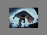
Might seem unfair to compare the two since it's a night painting, but a cave could well be pitch dark, but since I wanted more contrast to make things pop, I just added some light, and left the rationalization to poor dactylopus, should he choose to take the route.
Anyway, so the easiest way to introduce some big light blobs would be the sky, which is also incredibly handy, since clouds can look pretty much like anything, so you're free to mold it pretty much exactly to your liking.
Personally I'd focus on getting the monster to pop out of the backdrop, and since he seems dark, making the sky bright around him should do the trick, and would add some nice drama.
The second thing would be to get the shooter to pop, which is one of the challenges of the image. I think introducing some artificial light would be nice here, say, from a lamp, or torch on the ground. This would have some benefits: for starters, it would illuminate him, as there's little light at his spot. Secondly, it would provide warm light, that would contrast against the rest, and make him pop and add colour variation. Thirdly, it would help bring him closer, atmosphere wise, since we interpret warm coloured objects as being closer to us, further making him pop, and giving depth to the bg.
Just as important as the shooter, I'd really make the wizard at the edge pop, perhaps he's holding a staff with some nice lighting effects. Come to think of it, this should probably be the focal point of the image, so you should really try to come up with any reason to introduce contrast in this area. The monster is a big blob against a sky, the foreground guy is close and warmly coloured, so this guy needs his fair share of attention pullers.
Though this is messier, I'd also experiment with lowering the horizon. It shouldn't really affect the monster to any degree, and mostly the cliff. It would mess up the triangular composition to a degree, but I think it would be worth it, and should be solvable. Perhaps also moving closer to the shooter, making it feel more immediate, and personal. Having high angles tend to lead to a less urgent, distanced feeling, like watching an action scene from a chopper, rather than a hand held next to the actors.
Think it's a nice step, and reveals some of the challenges of the image (pretty much all images have these, so it's a matter of problem solving, and detecting these things early on is oh so much better than later). Also, as it often happens when one starts from black, it's quite on the dark side (it's the same as when you start from white, you tend to end up with bright images).
One way to check these things (as one quickly becomes accustomed to light levels, losing any objective sense), is to zoom out even more, and have a look:
Basically we only see some white outlines on a black canvas, and while this could be the case of a night time image, artists do usually try to add some contrasting elements.
For reference, here's the cave thumbnail sketch I did earlier in roughly the same size:
Might seem unfair to compare the two since it's a night painting, but a cave could well be pitch dark, but since I wanted more contrast to make things pop, I just added some light, and left the rationalization to poor dactylopus, should he choose to take the route.
Anyway, so the easiest way to introduce some big light blobs would be the sky, which is also incredibly handy, since clouds can look pretty much like anything, so you're free to mold it pretty much exactly to your liking.
Personally I'd focus on getting the monster to pop out of the backdrop, and since he seems dark, making the sky bright around him should do the trick, and would add some nice drama.
The second thing would be to get the shooter to pop, which is one of the challenges of the image. I think introducing some artificial light would be nice here, say, from a lamp, or torch on the ground. This would have some benefits: for starters, it would illuminate him, as there's little light at his spot. Secondly, it would provide warm light, that would contrast against the rest, and make him pop and add colour variation. Thirdly, it would help bring him closer, atmosphere wise, since we interpret warm coloured objects as being closer to us, further making him pop, and giving depth to the bg.
Just as important as the shooter, I'd really make the wizard at the edge pop, perhaps he's holding a staff with some nice lighting effects. Come to think of it, this should probably be the focal point of the image, so you should really try to come up with any reason to introduce contrast in this area. The monster is a big blob against a sky, the foreground guy is close and warmly coloured, so this guy needs his fair share of attention pullers.
Though this is messier, I'd also experiment with lowering the horizon. It shouldn't really affect the monster to any degree, and mostly the cliff. It would mess up the triangular composition to a degree, but I think it would be worth it, and should be solvable. Perhaps also moving closer to the shooter, making it feel more immediate, and personal. Having high angles tend to lead to a less urgent, distanced feeling, like watching an action scene from a chopper, rather than a hand held next to the actors.
#78
Competitions & Activities / Re: Monster Workshop - Week 2
Wed 15/05/2013 15:28:26
So when you're experimenting with lighting and composition, you really wanna keep it small n sketchy, to allow you to quickly try out ideas, or you'll run out of steam very soon.
The easiest way is to simply zoom out quite a bit, where you can no longer see any details, and work in that state, or, if you have a program like photoshop, just keep watching the navigator (thumbnail) window, and ignore the ugly blobs in the main window.
An additional benefit of working like this is that you'll run across plenty of "happy accidents", where the looseness of the sketch creates new ideas or seeds to ideas (one blob that you accidentally laid down may turn out to look like a weird cool tree stump, that you can keep n refine etc, or just ignore n paint over).
So in the case of dactylopus' monster, a very quick n sketchy idea could be this, which is basically just me slabbing down some shapes, without much thought (aside from the right lower cliff, which I paid at least some attention to:
Despite it being very quick and boring, you still get a sense of the pic, and hopefully it looks fairly exciting, despite it being just some vague shapes.
Just to show just how messy these things look in full res, here it is.
So yea, just try to ignore details as best as you can, and play around with blobs. If the blobs are exciting, details will be the cream on top of solid painting.
Btw, the grey border is there to try out a cropping of the image, and is just a grey solid on a topmost layer, which you can adjust as you want. This makes it easy to adjust the cropping at any point, as if you just expand the canvas size, you'll end up with no content in those hiddeen areas, whereas here you already have at least some sloppy blobs present.
#79
Competitions & Activities / Re: Monster Workshop - Week 2
Wed 15/05/2013 09:18:31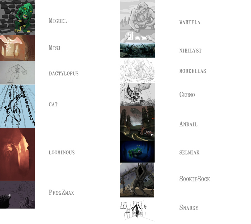
Miguel:
Looks nice, cool design, and I like the pose/expression. At this point I'd focus on experimenting with some lighting setups and backdrops, as the current ones are quite flat and uninteresting, and making sure the interesting parts pop out.
Misj:
Nice backdrop and flow, like the poses. The lack of values (or is she supposed to be white?) makes it tricky to get an overall impression though, which is what I'd focus on at this point.
dactylopus:
I like the low angle and the design could work out well with some nice dramatic lighting and backdrop. I'd focus on sketching out lighting and composition ideas, very roughly at first, then more refined when you're satisfied.
cat:
I like the roughness of the sketch, and that you've held off any details before going into values/colouring, as you're then able to experiment freely, without sticking to stuff because you like some rendering or details.
ProgZmax:
I like the triangular composition, the monster design, and it tells a story nicely. At this point I'd focus on trying out different composition ideas/lighting setups, before going into details and being stuck with renderings you don't want to ditch. The tricky thing with line art is that it doesn't tell whether a piece will work with values/colours, so you need to keep sketching up lighting ideas to see whether the piece will work as a whole, which is the point of thumbnails. It has the potential of being a very nice dramatic piece, or a flat composite of meticulously rendered elements. The easiest way to ensure the former is to work zoomed out (about the size of the above thumbnail, where you can't see any details), and work on the entire image, trying to make it work as light blobs. If you can show these blobs to someone and they go: "oo, looks like a nice pic!", then you've succeeded, and can start zooming in and add details, knowing that the piece will work as a whole.
waheela:
I like the idea and monster, and the sketching style in general, rough but readable. It's very flat atm, so I'd start differentiating areas value wise, preferably making important elements pop out, and subdue uninteresting ones.
nihilyst:
I like it in general, just feel rather flat atm, and the placement of boat is a bit on the edge of the pic. I'd try a lighting setup with light coming somewhere from around the boat to create a nice focus/interesting light setup, and creating more depth - since water contains plenty of scattering particles, you can add as much depth as you like atmosphere wise.
mordellas:
Looks very promising. Would start sketching in values asap, before spending more time on details, as you may end up finding that the current backdrop/composition doesn't work well with the lighting. Perhaps experiment with a lower angle? (the horizon is nice n low, but it would be nice to get a better sense of the scale of the (huge) monster).
Cerno:
Cool monster design, and nice roughness of the sketch (apart from the detailed claw like bubbly thingies), and with some tweaking it can be turned into a very nice dramatic scene. Atm I think the biggest thing to experiment with is the angle of the whole scene, making it less side view and flat and more 3/4 and with depth. While doing so, you could try pushing the values more, making things close the darkest, and the things furthest away brighter with very little contrast. Lastly, I'd try to achieve a nice focal point in the image, using values/lighting, where you choose a spot which you think is the most important/interesting, and making sure if pops out. The easiest is by making sure this area has the most contrast, either by having a dark object infront of a bright background, or a bright object infront of a dark, and making sure that the other areas have lower contrast, not to compete. You basically want the viewer's eyes to go straight to that point, and even when viewing the image as a small thumbnail our eyes should be drawn there, even though we have no idea what we're looking at.
Andail:
Looks neat, though a bit flat at this point, though I'm guessing you'll be tweaking these things. I'd either go for lots of atmosphere or punch, either could work in this case I think. It's kinda unclear whether you're going for a camera tilt atm, looks like it on the right, but not on the left. Think a tilt would work nicely in a dramatic/actiony scene like this.
selmiak:
Think you've created a nice focus/framing of the monster with the values and foreground. Think it's crucial to determine whether you're going to add any other characters at this point, as the composition/lighting needs to work for everything, so I'd focus on including all the major elements at this point, and setting up a composition/lighting that will make them pop.
SookieSock:
Cool idea n characters. I'd focus on making it more readable and exciting as a thumbnail at this point. Atm the monster kinda blends into the backdrop, instead of popping out, and there's no real light setup. You might have one in mind, but until you put it down, there's no real way to determine whether it'll work out as you wish. So I'd zoom out, and focus on the image as a bunch of blobs, and whether they work in this state, and forget about any details until you're happy with them in that crude state.
Snarky:
Really cool design, and I'm glad to see something more towards Tim Burton, though it may just be the sketching style. The angle is nice, but I'd experiment heavily with the backdrop, to ensure the piece doesn't fall due to a dull one.
-
Christ, with 14 entries this took its sweet time.
-
If someone wants to use the thumbnails/headers:
[img]http://marcus.krupa.se/AGS/workshop_13-05-05_monster/stage_II_thumbnails_compilation_a01.jpg[/img]

[b]Miguel:[/b]
[b]Misj:[/b]
[b]dactylopus:[/b]
[b]cat:[/b]
[b]loominous:[/b]
[b]ProgZmax:[/b]
[b]waheela:[/b]
[b]nihilyst:[/b]
[b]mordellas:[/b]
[b]Cerno:[/b]
[b]Andail:[/b]
[b]selmiak:[/b]
[b]SookieSock:[/b]
[b]Snarky:[/b]
SMF spam blocked by CleanTalk