Menu

Show posts

This section allows you to view all posts made by this member. Note that you can only see posts made in areas you currently have access to.

Show posts Menu

Messages - loominous

#21
Quote from: ThreeOhFour on Fri 03/07/2015 23:00:15
Look at James Gurney's thoughts on gamut mapping for an example of the sort of idea kept in mind when I start working.

Interesting video. It sounds like the kind of stuff you hear about in color theory but never really incorporate (speaking for myself), so it was cool to see in practice.

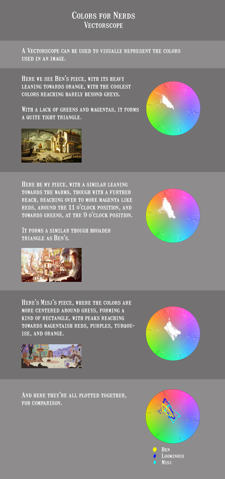
Curious about the gamut of my image, I ran my above version through a vectorscope, and then did the same with Ben's and Misj's entries.

#22
I agree that colors shouldn't be a mere afterthought, it's just that they're easy to alter later (well, depending on your approach). Values on the other hand, are less flexible - if I was to change the angle of the light at this point, it would be a major undertaking. If I wanted to change the hue of the stand parasol, it's a 5 second operation (my setup is focused on flexibility though, so with a less flexible setup it would take longer).

So it's more about getting the heavy duty stuff done first, like the layout/composition and lighting (values), which are very inflexible, and then experiment with the colors.

Again, this doesn't mean that the first thought about the piece's colors comes at the end, it's like with most things in a piece, you need to sort of project it onto the sketch in your mind while you're working, and I usually have a fair idea of how I want the colors to look, so even in the initial stages of the layout, I try to make sure that the layout will support it.

About hue contrast, I think it's like contrast in general, some moods are better evoked with milder contrast, some with higher. So I just let the mood I want dictate the amount of color contrast. Putting in some "real" cyans in my current piece would make them pop like crazy against all the warms, but it would also kill the mood.

So it's all about experimenting and learning what palettes you like by doing, so I think having as flexible setups as possible is very important, to allow for as much experimentation as possible, so instead of making some choices, get complacent, hoping the next piece will be better, you keep fiddling.

Edit:
For the record, I rarely introduce colors at the very end, I usually add sketchy colors after I've worked out the main lighting in the sketch, and then refine the values and colors simultaneously, with the focus on getting the values down first, but still knowing how it'll sort of look.
#23
Misj:

I don't think the sort of biased palettes of mine and Ben's entries are necessarily part of this workflow, though I think it encourages you to think more in terms of "looks" (called 'grading' in movies), than realism.

If you have a person just pick colors, they tend to be quite random, and it's often this randomness that you suppress when you want to go for "looks".

I think this is what many appreciate in pixelart, since, because of the color limitation, you often end up picking the same color for objects/areas that you wouldn't have if you could've just picked any color, causing a kind of forced color consistency, which becomes an inadvertent boon. So it's more about creating a nice palette, like a color designer, rather than adhering to realism.

It is true though that it can easily become a crutch, but I don't think it's part of the workflow, it's more that you already start out with a look, rather than nothing, and get to choose how much of it to keep. And once you're inside a look, it's often tempting to keep it rather than to keep pushing towards what often feels like dull realism.

For me it's about getting enough variation in there for it to not become too tiresome, while still evoking the mood I'm after, and this most often means keeping the hue variation rather limited, while still trying to get as much richness as possible in there. So it's a matter of finding the sweet spot between relieving realism and "instagram".
#24
Kinda messed up the progress saving, so I had to go back n find the changes, so it took a while.. but here's some progress:


Animated gif:


Still image:


--

Regarding wacom tablets, my advice is always to just go for as big as you can find/afford, the model isn't important really, any of the intuos series should be fine, as long as they haven't been scratched badly.
#25
Quote from: cat on Mon 29/06/2015 13:09:43
While I fully agree with B & C I see problems with A, especially since the light is coming from back/left and there can't be a tree that makes such a shadow.

Oh I didn't mean that the shape would be a tree shadow, just a tree, with darker leaves, which would look darker than the building facade, creating that shape (sort of).
#27
Last progress pre colors:

#28
Finally weekend, should be able to be more productive from now on.

Cat:

I think the image suffers from some focus isssues, so I whipped this up:

#29
Perhaps we'll just keep things rolling til the end date without any specific phases/dates til then. Unexpectedly heavy workload during the last week really messed up my schedule.

Eric:

Quote from: Eric on Thu 25/06/2015 03:05:29
Quote from: selmiak on Wed 24/06/2015 01:20:04
@eric: straight lines are easy in every paint app, just keep shift pressed. making the swirly pearly lines look interesting and keeping them the same boldness is a mystacle.

I find that the straight lines drawn this way don't have any character, though. These are more the sorts of things I grapple with. But I won't clutter the thread anymore!

I personally never use straight lines, I just don't like the stiffness, so I just use a large wacom tablet, and do everything by hand.

The reason the size of the tablet matters is that the larger the tablet is, the more you use your arm to control the pen, rather than your wrist/fingers, which leads to nicer more flowy lines in my experience.


Ben:

Feel free to post any progress regardless of stages etc, since I'd bet any insights into your process would be highly appreciated by many.
#30
Heh, me neither. Globally unfortunate week it seems.
#31
Quote from: Eric on Mon 22/06/2015 04:43:48
Quote from: loominous on Sat 20/06/2015 08:29:01
Sure, anyone's welcome to participate in any way they like.
Well here's a question from an interested observer, then. It seems many are getting to the point of dealing with non-organic objects--buildings, etc. Whenever I've tried to paint, and this is why I generally stick to lineart, I have a lot of trouble with...well, lines. Straight lines, curved lines, whatever. But things with hard edges. I'm sure any advice any of you have would be appreciated by all of the rest of us.

Could you elaborate? Are you having trouble with the lines not looking nice, or the shading of these hard edged objects?
#32
Quote from: Eric on Sat 20/06/2015 00:21:10
(Are outsiders allowed to post here?)

Sure, anyone's welcome to participate in any way they like.
#33
Kinda dropped the ball with the sketch presentation thing, so here's my last sketch in full res, pre refinement.


Mostly eager to start refining the design of everything to get rid of all the predictable generic stuff.
#34
Never heard of people doing colors before doing values, so I dunno how well that works.

But I think you can compare it to photography, you can easily strip a photo of colors to see how it works in black and white (and a nice photo will probably work well in b/w), but stripping it of values seems trickier. Can't really picture it to be honest. Just areas of color?

So to me it's about creating a strong b/w photo like picture first, to make the lighting/silhouettes functioning well, and then moving on to colors. It's not an ideal division for many reasons, but I don't see a good alternative.

But if you feel like going colors first, then by all means go ahead, but perhaps just hold off on tutorials etc until stage III (though the effort and your efforts in general are highly appreciated).
#35
Quote from: Misj' on Wed 17/06/2015 15:54:21
Quote from: loominous on Tue 16/06/2015 06:27:26I suggest we leave colors to stage III, so this would be about creating a detailed "back and white" piece.

I don't really agree with that. While I know that some people work with shades (values) that are then colored, another - equally valid - approach is to start with flat colors that are then shaded.

Using values and adding colors only as a refinement (almost as an afterthought) really never worked for me as I didn't find the pieces where I did that appealing (in my style). Personally I use a combination of hues, values, and saturation with a higher emphasis on hues than saturation (though they all go hand in hand) and - again adapting it from comics - starting with flat coloring that is then refined into shapes.

It's mostly about separating things into steps, so we can focus on one thing at a time. People are of course free to start using colors, but perhaps we should put the major color discussions off til stage III.

It's like the thumbnails, it sort of forces you to look at the piece from a very basic but important perspective before moving on, to make sure everything is working properly, before getting distracted by other things. So in this case it would be about making sure the picture is working well on a value level before getting distracted by colors.
#36
Quote from: cat on Tue 16/06/2015 11:37:10
For the next stage I suppose we should start to work in the final resolution?

Well, all these things are up to you, but I would suggest you do, to avoid having to redraw stuff in stage III.

Quote from: cat on Tue 16/06/2015 11:37:10
I never painted a background before (I'm still not sure which style I will choose). What are your recommendations? Do you make a larger painting and scale down later? Do you work in the final resolution? What resolutions do you prefer?

I personally prefer to work in the end resolution, though with some margins on the side, so you can reposition the image (so your workspace is larger than the image).

I just like how the pixels turn out when you work in the end resolution, something about the anti-aliasing or something, which you don't get when you scale down stuff. Course my stuff usually end up looking slightly blurry, which I kinda like, though the crispiness of for instance Daniel's pieces are usually stunning, though hard to pull off correctly in my experience.
#38
Mainly messing about with the foreground:

#39
Cat:

Good to see your experiments working out well!

One thing you could consider would be lowering the camera angle, so I whipped this up:

#40
Misj:

I really like where you've taken the scene, much better in my opinion.

Regarding picking light direction, I agree it's like the silhouette thing in character design. I do however think that it's probably best to lay down a lighting setup for the entire scene, see which works best for the scene as a whole (interesting shapes, good highlighting of the important parts), and then move around any objects that aren't popping properly (silhouette-wise) to stand out properly.

It's always a back n forth tug-o-war when it comes to these things, one solution messing up the silhouettes, another fixing them but making the overall focus wrong, but I think it's probably best to focus on the scene as a whole, when making these decisions.

The good thing is that the more one does this, the more one gets a feel for how these things will work even when one is doing pure lineart, as you stop thinking in terms of lines, and more about collections of shapes that the lines will form, once values have been added, and have possible lighting solutions already in mind.
SMF spam blocked by CleanTalk